

Key Takeaways
- Coverage map colors indicate predicted signal strength, not guaranteed real-world performance.
- Buildings, terrain, and network congestion can dramatically reduce actual signal indoors.
- Third-party tools and crowd-sourced data offer a more realistic view of coverage quality.
- Always test coverage in the specific locations you use most before committing to a plan.
- Rural and suburban gaps are often understated on carrier-published maps.
What Coverage Maps Actually Show
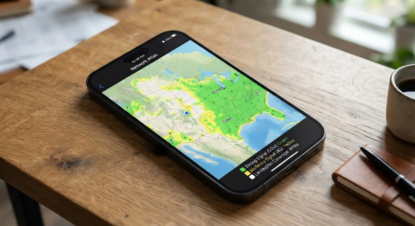
Carrier coverage maps are predictive models - not live measurements. They estimate where a signal should reach based on tower locations, antenna power, and terrain data. The color coding typically follows a simple scale: darker or bolder colors (usually green or dark blue) indicate strong predicted signal, while lighter shades or gaps represent weaker or no coverage.
What the maps don't show is equally important. They don't account for how many users are sharing a tower at any given time, whether a building's walls will absorb signal, or how local geography like hills and dense tree cover affects propagation. As the fine print on carrier plans often reveals, the glossy presentation rarely tells the full story.
Coverage vs. Capacity: A Key Distinction
A tower can 'cover' an area while still being unable to deliver fast, reliable service if it's overloaded with users. This is especially common in dense urban areas during peak hours or at large events. Coverage maps show predicted signal reach, not available bandwidth - two very different things. For a related look at how this applies to home internet plans, see our article on where 5G actually reaches.
The Gap Between Predicted and Real-World Signal
Signal penetration indoors is one of the most significant variables a coverage map can't capture. Higher-frequency signals - including much of the mid- and high-band 5G spectrum - are more easily blocked by concrete, brick, and even modern energy-efficient window glass. A strong outdoor reading can translate to poor or no usable signal a few feet inside a building.
Rural areas present a different challenge. Carriers sometimes shade wide geographic areas as covered based on tower reach in open terrain, but valleys, ridgelines, and vegetation can create dead zones that the model misses. For a deeper look at how this plays out in practice, see our guide on internet options in rural areas.
~30%
Signal strength lost passing through standard building walls
Radio frequency engineering studies consistently show that common building materials can attenuate cellular signal by 10-30 dB or more, significantly reducing indoor usability even in nominally covered areas.
~21M
Americans lacking reliable broadband access
According to FCC reporting, millions of U.S. households in rural and underserved areas remain without access to reliable fixed or mobile broadband, a gap coverage maps often fail to represent accurately.
Best Practices for Using Coverage Maps Effectively
Coverage maps are a useful starting point, not a final answer. Here's how to use them without being misled.
Cross-reference carrier maps with independent network testing reports before switching plans.
Carrier maps are produced by the carrier and optimized to highlight coverage rather than expose gaps. Independent organizations test actual user performance and publish comparative data that is not financially motivated to favor any provider.
Use crowd-sourced signal apps to check coverage at specific addresses, not just broad regions.
Coverage maps display large geographic zones, but your experience is determined by what happens at your home, office, or commute route. Crowd-sourced tools aggregate real user reports at the street level, revealing gaps the zone-level map obscures.
Request or use a trial period to test service at the locations you use most.
No map or report can substitute for testing actual performance in your real environment. Many carriers offer short trial windows; using them systematically - testing at home, at work, and on your regular commute - gives you ground-truth data.
Understand what each color tier on a carrier map actually represents before drawing conclusions.
Color conventions are not standardized across carriers. One carrier's 'good coverage' tier may represent an outdoor signal that doesn't penetrate walls well, while another's may indicate a different technology band entirely. Reading the map legend critically prevents misinterpretation.
Check coverage along routes you travel regularly, not only at your home address.
Most people evaluate coverage based on where they live, but signal failures during commutes, road trips, or regular travel corridors are equally disruptive. A plan that works at home but drops calls on a daily drive undermines the value of the service.
Quick Steps You Can Take Right Now
If you're evaluating a new carrier or troubleshooting existing coverage problems, a few targeted actions can give you a clearer picture faster than any map alone.
Why Third-Party Data Is Worth Consulting
Independent network testing organizations collect real-world performance data from millions of devices and publish findings that reflect actual user experience rather than carrier projections. These reports measure download speeds, call success rates, and latency across geographic regions - metrics that coverage maps simply don't convey.
Crowd-sourced signal apps let individual users report what they're actually seeing at specific locations, building a ground-level layer of data that complements (and sometimes contradicts) carrier maps. This is particularly useful in urban neighborhoods with dense construction or in suburban corridors where signal can vary block by block. The same principle applies to home broadband - as our explainer on advertised versus actual internet speeds shows, the number on the map or plan page rarely matches what lands at your device.
“A coverage map is a marketing document as much as it is a technical one. The most useful question to ask is not 'Am I in a covered area?' but 'What does coverage actually mean here, under real conditions?'”
— Consumer Reports Telecom Research Team, Independent product testing and consumer advocacy organization